
Football kits bridge performance and lifestyle like no other sporting attire. Without even knowing what they’re wearing, only knowing that it looks fly as hell, you see people walking around in the famed blaugrana stripes of Barcelona, the white sleeves of Arsenal or the historic bianconeri shirt of Juventus. They're really the only sports garments you can wear outside the stadium without looking like a child trapped inside the body of a demented adult.
For some, a lifelong passion begins with the simple affection for the way a particular kit looks. Kits are important — scorn and derision welcomes unwanted changes and poor design at clubs across the world. But in MLS, a league in which it’s incredibly important that clubs with very little history craft an identity and establish a connection with their city, the cookie-cutter approach of adidas means the league has the blandest, least inspiring kits in the world.
In an interview with Mlssoccer.com, Sam Handy, the VP of design for adidas who leads “the charge to design the kits that every MLS club wears,” spoke of how he’d just recently attended his first MLS game in Portland.
“I thought it was proper football. It wasn’t what I was expecting,” said Handy. That in-depth knowledge is beautifully reciprocated in the design of the 2017 MLS jerseys, which are essentially all the same.
“We design for MLS a little differently than we do with European clubs, because of the way the league is set up. We try to have a harmonized approach and a design that works through all of the kits,” said Handy.
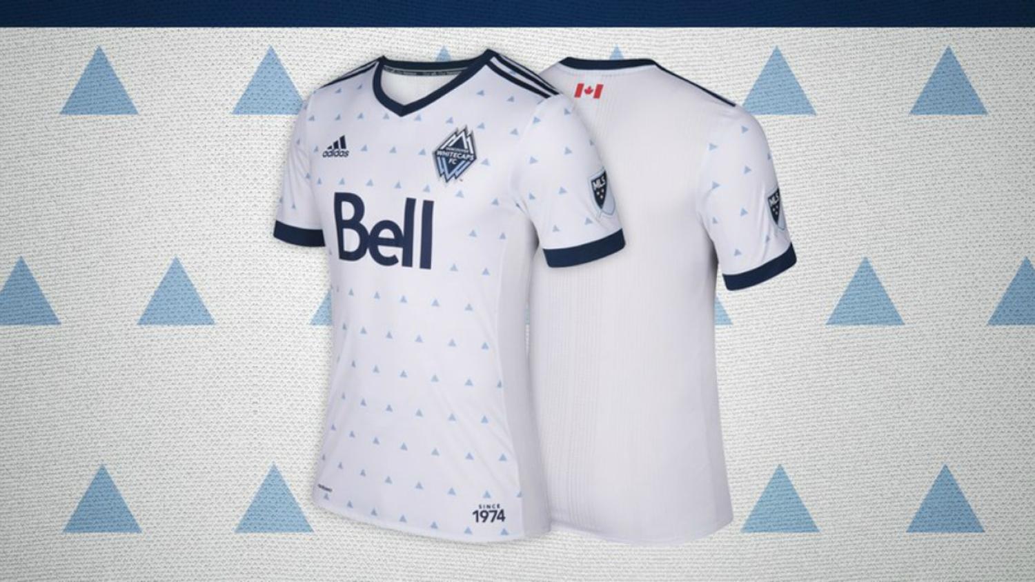
Harmonized is a euphemism for yawn-inducing. For the 2017 MLS jerseys, MLS and adidas just really couldn’t be bothered. What sets apart the clubs is different collars and colors (although NYCFC and Sporting Kansas City don’t even manage that).
Each team has the adidas three stripes running to the shoulder. Like the jerseys themselves, the stripes can’t even be assed to go the whole way. This gives the shirts a little shoulder pad effect that makes every jersey look like training wear for a jogger. Oh, but every team has custom cuffs — so you're definitely going to want to shell out $120 for that.
Here's Houston's "Forever Orange" kit. It's orange.

Photo: @RomellSamir | Twitter
Here's Montreal's. At least the socks are dope.

Photo: @impactmontreal | Twitter
Here's Chicago's. It's gray because Chicago is a concrete jungle.

Photo: @Jr_Rodrig0 | Twitter
Here's a man with a rare form of skin disease.

Photo: @BOLACRIS7 | Twitter
There are better kits on display during Sunday rec league. There are high schools that display more thought and pride in their attire than MLS. It’s a shame because soccer jerseys are such a great pathway to a mainstream audience, but this utilitarian approach is godawful.