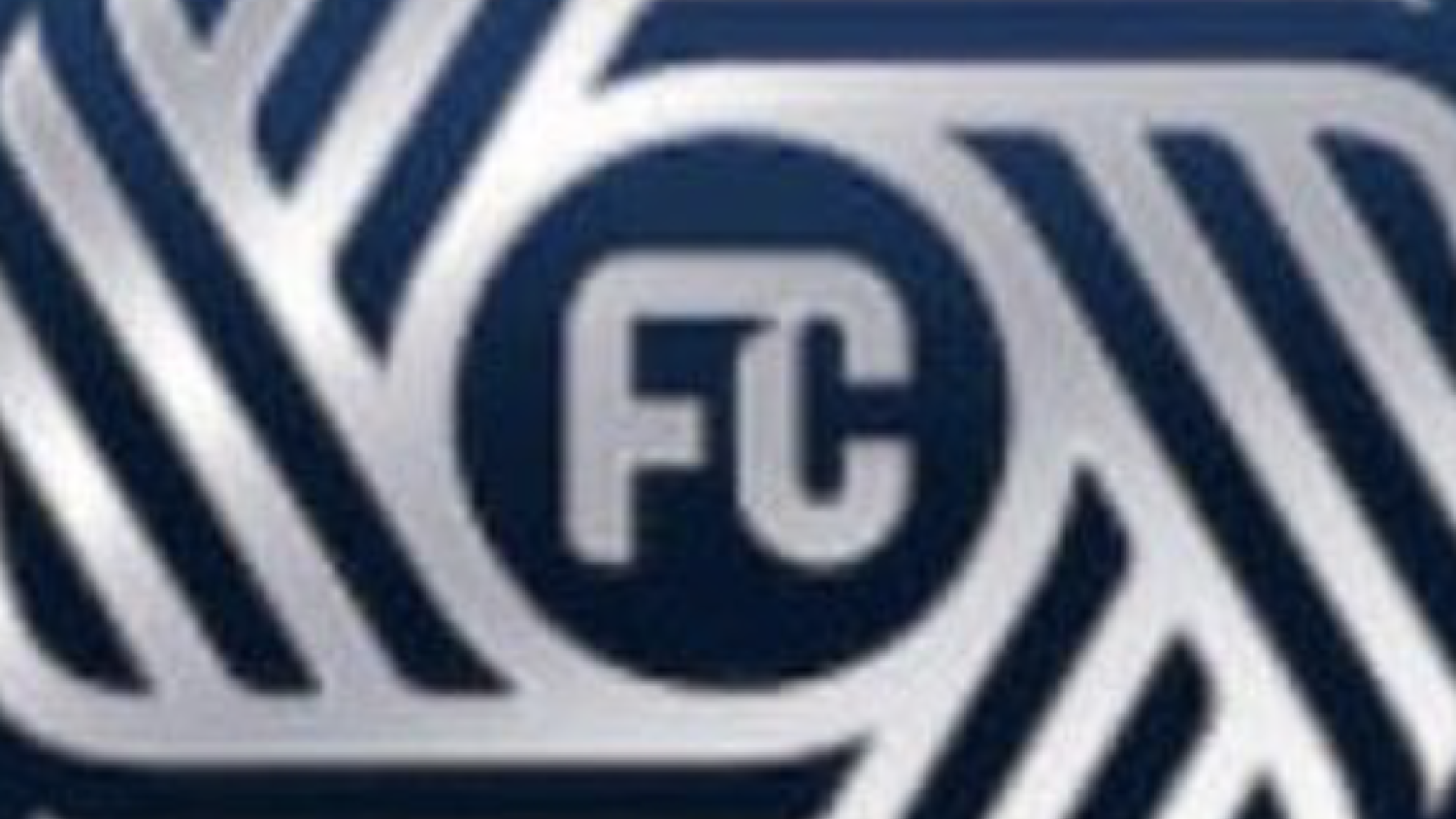
The name and logo for San Diego’s new Major League Soccer team were leaked and it’s the worst we’ve ever seen.
San Diego’s ownership group paid a staggering record expansion fee of $500 million to become the 30th team in the league. Imagine dropping half a billion dollars for a crest and logo that looks — and pardon my French — this dogshit.
San Diego MLS logo and name are awful
San Diego’s MLS expansion team, which is set to take the field in 2025, has officially selected a brand identity in addition to its name: San Diego FC.
More details: https://t.co/BIRpbcawmh pic.twitter.com/qunRMUBxzz— The Athletic Soccer (@TheAthleticSCCR) October 19, 2023
San Diego FC. How original. Nothing like slapping “FC” or “SC” onto the name of the city with the team.
MLS used to be unique from the rest of the world and Americanized team names. The Seattle Sounders, Colorado Rapids and LA Galaxy are just a few examples of the great club names.
The list of previous expansion teams shows the monotonous naming trend of trying to be European: St. Louis City SC, Charlotte FC, Austin FC, Nashville SC.. you get the point.
Having a crest even lamer than the name seemed impossible, but the fine creative staff in San Diego found a way.
This logo stinks. To bring back one of my favorite sayings: San Diego’s logo stinks like dogshit sitting in a trash can half-filled with water on a hot summer day.
What the hell even is it? A chrome soccer ball with “FC” in the middle?
Here was the reaction from fans.
Imagine going from the San Diego Loyal to whatever the San Diego FC thing is…
Honestly, it’s like a car brand and a sheriff badge had a very ugly baby. pic.twitter.com/BLM416Z9Ir— Manuel Veth (@ManuelVeth) October 19, 2023
— Rcblue (@rcblue5) October 19, 2023
I asked Bing to generate some options. https://t.co/oZn13jaJjk pic.twitter.com/OrfVfoxewM
— Ben Wright (@benwright) October 19, 2023
San Diego soccer teams have given us the blueprint of the good and the awful.
San Diego Wave FC, the NWSL club in the city, showed everyone how to make a badass logo, name and color scheme to excite fans.
SD Wave is just so good and screams Southern California. San Diego FC is boring trash and this logo is boring trash. pic.twitter.com/lCMq117rvj
— Jose (@Jm8galaxy) October 19, 2023
THIS is how to announce an expansion team.
San Diego FC’s new name and logo is a bad joke that doesn’t deserve to be in MLS.
There’s nothing wrong with admitting defeat and going back to the drawing board. The Chicago Fire and the “Sonic the Hedgehog” movie both gave designs the fans HATED and then made correct adjustments.
The backlash from fans forced those creatives to redesign the looks. All I’m saying is that a petition needs to be started to change the crest and name to give the fine people of San Diego a team they can get behind.


