
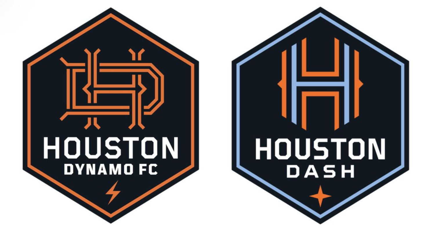
The Houston Dash of the NWSL and Dynamo of MLS took a massive step in their club’s history on Tuesday with a rebrand featuring new logos. The new Houston Dynamo logo has strayed far away from the original badge the club donned in its inaugural 2006 season. The Dash logo took a similar approach as well.
We grind. We shine. We are Houston.
— Houston Dash (@HoustonDash) November 17, 2020
official: Houston Dynamo and Houston Dash unveil new logos as part of their rebrand #HoldItDown pic.twitter.com/Esryqq7nVK
— FOX Soccer (@FOXSoccer) November 17, 2020
It should also be noted that the Dynamo tacked on the “FC” to the club name, a move that MLS clubs are still divided on.
Former Dynamo player and top broadcaster Stu Holden announced the Houston rebrand alongside club president John Walker. The full announcement video can be viewed here. A further explanation for each element of the logos was also provided.
One city. One club.#HoldItDown pic.twitter.com/vkCsGfsEeC
— Houston Dynamo FC (@HoustonDynamo) November 17, 2020
It's all in the #HoldItDown pic.twitter.com/jGNcSTLkiQ
— Houston Dash (@HoustonDash) November 17, 2020
As you could probably predict, the fans on Twitter didn’t take kindly to the rebrand. Changing a logo after nearly 15 years is sure to rub some people the wrong way.
Deletion worthy logo
— Derek (Lletget Stan) (@rays1299) November 17, 2020
The hexagon has six sides, representing the fact that we've missed the playoffs in six of the last seven seasons.#BrenerOut #BoycottDynamo
— #BrenerOut (@BrenerOut) November 17, 2020
Literally nobody cares. We just want to see a competitive team that has a chance to actually compete every night.
— JohnL (@John_Leader) November 17, 2020
Pathetic piece of joke, I hope the designer is ashamed. What a disgrace to this great city. John Walker go home.
— Señor Gol (@footballandgoal) November 17, 2020
At least super supporter RobGee showed the Dash’s logo some love.
Yall's is cool. Not on the men's side
— RobGee (@Capitan47Milag) November 17, 2020
I’m here to break from the mold. These new logos are lightyears better than their predecessors due to one key change:
NO MORE GENERIC BLACK AND WHITE SOCCER BALLS
![]()
![]()
No one uses or has seen a black and white soccer ball since Medieval Times. I cringe inside every time my eyes are forced to look upon the horrendous thing.
Are the new Houston logos top of the line quality? No. I will say the Dash got the better end of the deal with the rebrand. The Dynamo and St. Louis City SC appear to be having a competition of who can have more lines that look like spaghetti on their logo.
New profile pic, who dis? #stlCITYsc #OurCITYOurSpirit pic.twitter.com/utouQWE44b
— St. Louis CITY SC (@MLS4theLou) August 13, 2020
Spaghetti lines or average logos debate aside, I do get a weird baseball vibe from the new Dynamo logo. It’s as if the San Francisco Giants allowed the Dynamo to copy their homework but didn't make it look too similar.
This new era of Houston soccer promises a further commitment to the sport in the city. Club president Walker said this project has been in the works for years.
“Today is a marquee moment for the club and is the culmination of over two years’ worth of work. In addition to wonderful creative work on the new crests, we’ve also made significant enhancements and improvements in a variety of areas that demonstrate our commitment to being Houston’s team,” club president John Walker said in the announcement video.