On Monday, FC Cincinnati took the next step toward its inaugural 2019 MLS season by unveiling an overhaul to the crest it’s been using since the club’s 2016 debut in the United Soccer League.
The rebrand was headed by Interbrand, the same firm that accounted for the much-debated modernizing of Juventus’s crest.
Out with the old.
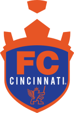
In with the new.
Now that's next-level. #IgniteUnite
— FC Cincinnati (@fccincinnati) November 12, 2018
You be the judge.
But it wouldn’t be a modern day brand reveal without a noxious look at the sweet, sweet details. (Did you know that the sword stands for “Ready for battle?” Did you want to know?)
The full story behind our crest...
— FC Cincinnati (@fccincinnati) November 12, 2018
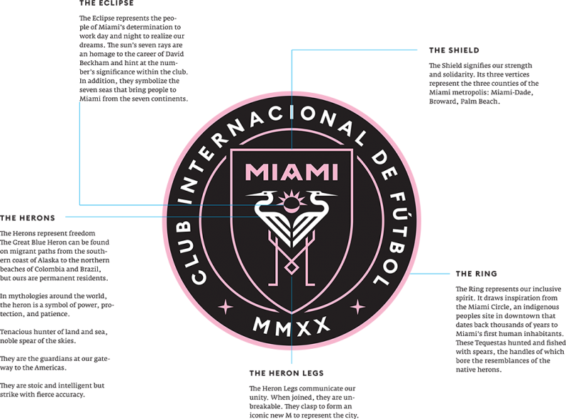
In recent MLS times, we’ve also seen this from David Beckham’s Club Internacional de Fútbol Miami. (Did you know that The Eclipse represents the people of Miami’s determination to work day and night to realize their dreams and that the sun’s seven rays are a shoutout to Beckham’s No. 7?)
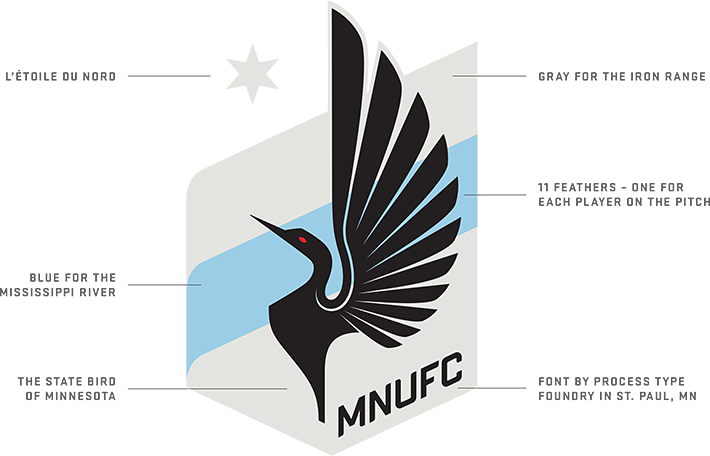
Minnesota United. (The Loon has 11 feathers 'cause there are 11 players on the pitch, you dangus.)
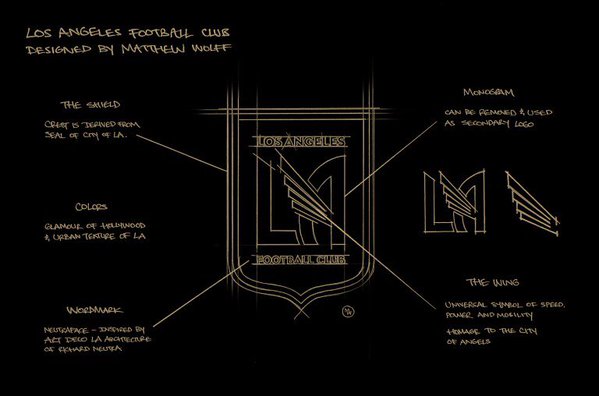
And the mother of all brands, LAFC. (The colors combine the glamour of Hollywood and the gritty urban sprawl of Los Angeles.)
But they were all of them deceived, for another crestsplainer was made: In the land of Wisconsin, in the fires of Twitter, Madison Pro Soccer forged, in secret, a master #LogoExplainer to rule all others.
Our placeholder logo will be no more in four days, but did anyone really understand its true meaning? We've created a #LogoExplainer to make it all clear... pic.twitter.com/qnkUm9UK85
— Madison Pro Soccer (@MadisonProSocc) November 14, 2018
We’re already fans of this team and the wars they wage.
— Madison Pro Soccer (@MadisonProSocc) November 14, 2018

 Home
Home