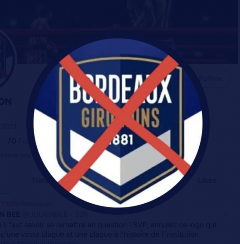
Clubs are constantly trying to find ways to reach and expand their audiences. The boldest way that teams attempt this feat is through changing the identity of the club with a new logo. Ligue 1 side Bordeaux is the latest to make tweaks to the badge on the front of the jersey and released a short video on Twitter showing the transformation.
L'identité graphique du FC Girondins de Bordeaux évolue
https://t.co/nRoCzkREqx pic.twitter.com/XiB8pUzT3S— FC Girondins de Bordeaux (@girondins) June 30, 2020
Better? pic.twitter.com/qbBa81EXky
— Footy Headlines (@Footy_Headlines) June 30, 2020
A comparison between the old and new logo shows the crest has only been slightly tweaked. Even these small variations managed to piss off the majority of Bordeaux supporters. Some followers even took the measure of changing their Twitter profile picture to let the club owners know how they feel about the new logo.
If even these minor tweaks to a badge can cause such an uproar, you can imagine the backlash that these next five badge changes caused. Here are five of the worst soccer logo changes.
Top Five Worst Soccer Logo Changes
1. Nantes
French side FC Nantes have unveiled a new badge.
The ship illustrating the harbour is gone.
The stars representing their league titles have been removed.
Only one out of five Breton hermines remain.
A slick N is what's left in a logo that reminds us of Juventus.#FCNantes #badge pic.twitter.com/l17In8pZWA— World Football Club Crests (@WorldClubCrests) May 22, 2019
For some reason clubs have decided that minimalism is the new desirable look. A certain team that is definitely on this list started the trend and it seems Nantes was all for it. The old logo showed history, style and actually looked like a badge. The new one looks like if Nashville SC put a little less effort into its logo.
2. Chicago Fire
It's the first logo change in the 20+ year history of the Chicago Fire, shown here next to their old logo for comparison
— Chris Creamer - SportsLogos.Net (@sportslogosnet) November 21, 2019
The rebrand of Chicago Fire at the end of 2019 was looking great. The club changed the name from Chicago Fire Soccer Club to Chicago Fire Football Club, the team announced it would play in Soldier Field for the 2020 season and then proceeded to strike out with the logo change. New owner Joe Mansueto is still planning to test the waters with the pointy logo to see if it will grow on fans. We’ll see how that pans out.
3. Juventus
'The new Juventus logo'.... football clubs have badges and club crests. Businesses have logos. Juve have taken a L for this. pic.twitter.com/gZF6y7Gn2d
— marcelo bielsa (@Moe_Lorenzo) January 17, 2017
Juventus unveiling its new look in 2017 is by far one of the most debated and controversial logo changes in the history of the sport. This was an absolute power move with the Italian giant rebranding itself with a sleek new look to appeal to global consumers. The move worked — Juventus’ new logo is also a new identity that gives off the sense of wealth, class and entertainment. The only issue is the history that gets left behind with a change so large.
4. Manchester City
The Evolution of the Manchester City logos. pic.twitter.com/pkOQD8ptF1
— Pholoho (@Pholoho) July 6, 2016
Cityzen fans had their wish granted in 2015 when they asked to revert back to a circular badge with a shield and a ship rather than the Eagle that was adopted in 1997. The club’s supporters asked to fall back to the club’s history and the owners listened. The historical significance is great to keep alive, but man the Eagle was badass. Growing up only ever seeing the Eagle crest made it hard to say goodbye to the majestic bird.
5. Ecuador
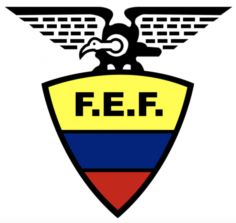
Old Ecuador logo.
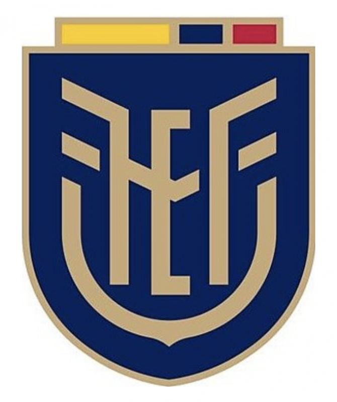
New Ecuador logo.
Speaking of majestic birds getting the axe, Ecuador recently decided that the Andean condor shall be no more. At the start of 2020 before everything went to absolute hell, the Ecuadorian Football Federation chose minimalism for the new logo. Thankfully the new look was nowhere near as horrid as Nantes, but it was hard to say goodbye to the condor on top of the crest. The bird now hides within the letters of the new logo.

 Home
Home