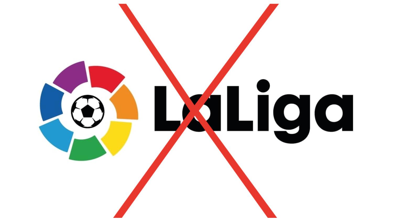
The old LaLiga logo wasn't perfect. It was guilty of what I consider a cardinal sin: containing that damn generic soccer ball that's way too heavy-handed in getting its point across.
But LaLiga had established a powerful brand identity with its iconic color wheel over the past 30 years, and when news broke of an all-new LaLiga logo for the 2023-24 season, the initial thought was concerning how the league would reimagine and update the famous design while retaining some sense of history.
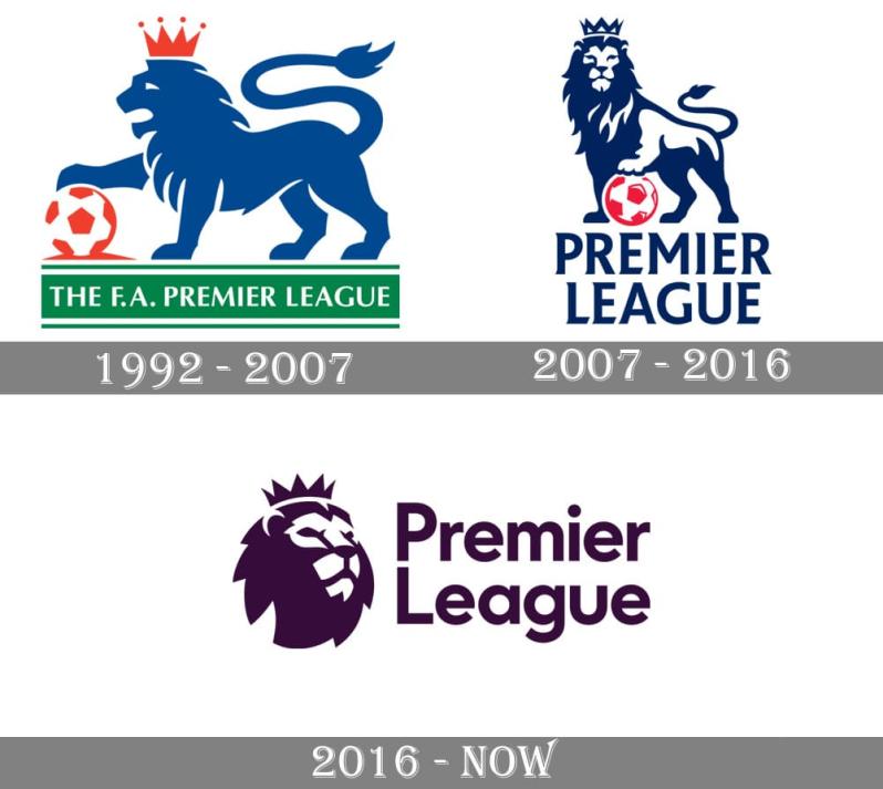
For example, the Premier League has rethought its logo over the years but always wisely retained the iconography that's become synonymous with the division — the lion with a crown.

Photo: 1000 Logos
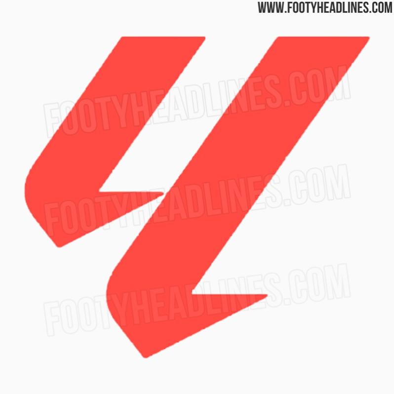
But instead of using the color-spectrum logo as the guiding principle on the redesign, LaLiga, according to the latest leak from Footy Headlines, is set to go an entirely different direction.
Some people see a "4," some a "y," and others a strange version of the Unreal Engine logo, but it's an "ll" symbol in pale red.


It's pretty easy to see LaLiga president Javier Tebas signing off on this. When he's not blocking Lionel Messi's return to Barça, he's trying to move every Spanish competition outside of Spain.
I'll definitely miss the color wheel on the jersey patches. We had some great times together.
The LaLiga rebrand also comes with a new kit font and a change of commercial sponsorship — what once was LaLiga Santander becomes LaLiga EA Sports FC next season.


