
One thing I always look forward to with a new season is the revamped kits, especially the third kits. The home and away jerseys are always the same colors as last season’s with a new design. This is not the case for the almighty third kit.
The tertiary uniform is not so much cloth on a player as it is an opportunity — a chance to create a statement or an artistic beauty for the brand. There are no borders or guidelines to follow for the artist behind the creation of the third kit. The entire color palette lies at the disposal of the artist. Any design network the brain can formulate is in the cards. The opportunities are endless!
While infinite avenues of artistic expression exist, this is not a risk-free environment. The design chosen for the third kit will be met with the highest levels of scrutiny. With expectation levels on the highest echelon, there is hardly any room for error.
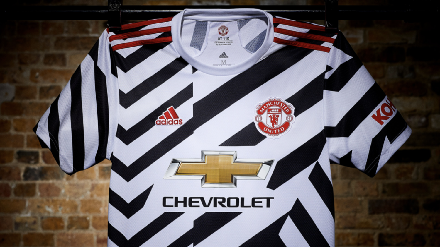
And so, with the weight of the football and artistic world on the weight of adidas’ shoulders, the masterminds decided to make Manchester United look like Zebras.
Ready to stand out.
#ReadyForSport.Our new third shirt by @adidasfootball, on sale now: https://t.co/4xh5r5QfCh#MUFC pic.twitter.com/9hQHcBJMqf— Manchester United (@ManUtd) September 8, 2020
I wrote an article about the worst Premier League jerseys prior to the release of these monstrosities. This awful third kit would have been number one without a doubt. If Chris Rock doesn’t wear this uniform and pretend to be Marty from Madagascar, then I will be thoroughly bummed.
The Red Devils aren’t the only team to strike out with the third kit. Let’s look at what else Europe has to offer in the third kit department.
Chelsea Palace
Meet a new legacy. The 20/21 @nikefootball third kit is here!
One for the sneakerheads , inspired by the 1990s Ultramarine Air Max 180 and classic shirts of the past!Available 10.09.20. #ItsAChelseaThing pic.twitter.com/mWRnkhCMWh
— Chelsea FC (@ChelseaFC) September 7, 2020
A little awkward that your club’s anthem title is “Blue is the Colour” and then you have RED on the third kit. Besides wearing the opposite of the team’s color, the third kit looks like a knock-off Crystal Palace uniform. The nearby London club questioned Chelsea’s “It’s A Chelsea Thing” hashtag.
#ItsNotThoughIsIt https://t.co/Jjh7eLot04
— Crystal Palace F.C. (@CPFC) September 7, 2020
Tottenham Doing The Least
Our new @nikefootball third kit for 2020/21!
— Tottenham Hotspur (@SpursOfficial) September 7, 2020
Remember that whole spiel about the color palette and all of art at the touch of a fingertip? Someone at Nike forgot to mark their calendar that the Tottenham third kit design was due and just threw a dart at a color square.
“Ope, plain yellow shirt with no other features it is then,” is how I imagine the thought process behind this kit went.
Juventus Goes Loko
Driven by our vision we express our true selves #ReadyForSport #createdwithadidas @adidasfootball
Available now on the Juventus Official Online Store https://t.co/ZpBXIRiths pic.twitter.com/Eda90cQPHA— JuventusFC (@juventusfcen) August 29, 2020
This time adidas actually went for something unique and while it might be a bit on the eyes, it’s not the worst third kit in the world. I will say though that staring at this jersey gives me PTSD and I can’t figure out why.
Let me think, let me think, let me think.
Oh, I remember now.

*shivers*
Battle For Pink Supremacy
Our third kit 20/21#OnlyForCulers pic.twitter.com/3vh3wjryEP
— FC Barcelona (@FCBarcelona) September 7, 2020
Real Madrid 20/21 Away
Adidas have taken the pink from Real’s 20/21 home kit and gone all in on this one.A very simple design that uses only pink and blue throughout with a V neck & the ‘3 stripes’ down the inside.
A lot of people may like this. Not me
KIT MAN RATING 3/10 pic.twitter.com/osg72F5QzM
— THE KIT MAN (@kitman_the) July 31, 2020
The battle for LaLiga supremacy has now shifted off the pitch and into the kits. Pink is in fashion and never a bad look, but who will wear it better?
I really want Real Madrid and Barcelona to play each other with both teams wearing pink so it will look like this:
Wavy RB Leipzig
RB Leipzig's brand new third kit is seriously impressive pic.twitter.com/hQuTHzq3AC
— Goal (@goal) September 7, 2020
Last season’s Champions League semifinalist will hope to ride the wave of its recent success. In doing so, Nike put the metaphorical waves on the kit to help RB Leipzig challenge Borussia Dortmund for second place in the Bundesliga next season.
Real talk: I will absolutely be getting a Tyler Adams RB Leipzig third kit this year.