
If this year's soccer kits seemed even worse than usual, it's because they were.
Every kit release is accompanied by internet outlash and general dissatisfaction. You can say that Twitter trolls are a factor, but the fact is that the quality of soccer kit designs is steadily declining.
The culprit is money. The constant updating of kits, drastic changes from season to season, the need for third, fourth and sometimes even fifth kits — it's all a ploy for teams to make more money. Clubs will wear away kits when there isn't a color clash so fans will be incited to buy that jersey.
In the not-too-distant past, clubs would keep the same kits for multiple seasons. And even when teams designed new jerseys, they were still similar to the old ones. It was almost a guarantee that Arsenal's new away kit would be some combination of yellow and blue.
Now, clubs make significant changes in kit colors every season to coerce fans into spending more money. One season the Gunners' visiting top will be purple and black horizontal stripes, the next year it's the traditional yellow and blue and the following season black with pink lettering.
Liverpool has been even worse, changing its away kit color each of the past 10 seasons.
The byproduct of this scheme is that with the myriad kits already out there, teams can only design so many unique jerseys that still look good. This means clubs are forced to push boundaries to design new kits, meaning that often these kits are downright hideous.
Compiling a list of the worst soccer kits of 2020 was difficult simply because there were so many bad jerseys out there. But we managed to do it.
Here they are: the worst kits of 2020.
Worst Soccer Kits of 2020
Juventus Third Kit (20-21)
I don't care if Cristiano Ronaldo or Weston McKennie wear it, this kit is bad. Adidas insists on using abstract designs on their jerseys when they clearly are not working. It's pretty hard to make an adidas soccer jersey look bad, but somehow adidas has managed to pull that off.
Manchester City Third Kit (20-21)
I'm not sure if this looks like one of those hideous patterns that you find on the clearance rack at Jo-Ann Fabrics or one of those pre-downloaded homescreen backgrounds that you could use on your cell phone in 2010. Either way, this jersey is not good.
Club León Third Kit (2020)

Noticing a pattern here? Teams often experiment with their alternate kit, which is rarely worn, leading to a lot of interesting, but not necessarily good, designs. Even without the distracting black horizontal lines, there is too much going on in this kit.
Granada, AZ and Kaiserslautern Third Kit (20-21)
As if this kit wasn't bad enough, Nike decided to supply it to three different teams. These colors rarely work well on their own and look even worse when put together. The Granada version stands out as the worst due to the strong color of the sponsors on the kit.
Wolverhampton Wanderers Away Kit (20-21)

Wolves Away Kit (20-21) via Soccer.com
Calling this kit "bold" would be putting it nicely. If you take away the blue, the shirt would actually look quite nice. Instead it looks like a starving artist made a mediocre abstract painting that they were never able to sell. The Juve third kit didn't work, and this one doesn't either.
İstanbul Başakşehir F.K Third Kit (20-21)
Futbol takımımız, 2020-2021 sezonunda alternatif forma olarak küresel iklim değişikliği ve orman yangınlarına dikkat çekmek amacıyla ‘Doğa konseptli’ yeşil forma giyecektir.#Yeşillendiriyoruz
— İstanbul Başakşehir (@ibfk2014) September 14, 2020
It's never a good sign when you have to count how many colors are on a jersey. That shade of green should not be on a soccer jersey, but combining it with orange detailing and numbers should be a punishable offense.
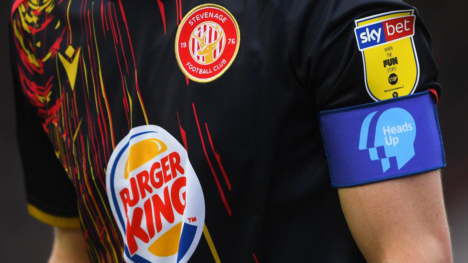
Stevenage Home & Away Kit (19-20)
These fast-food inspired monstrosities were both so atrocious that they each had to be included. The Burger King logo is bad enough, and a poor design overall makes both of these kits difficult to look at.
West Brom Third Kit (20-21)
The Baggies' yellow and green away jersey was also a contender here, but it couldn't quite match the repulsiveness of the club's blinding third kit. While not sponsored by any fast-food burger chains, West Brom provides a reminder that yellow and red are colors that should not be mixed.
Napoli Away Kit (19-20)
What did I say about using that gross green color for jerseys? Usually, when a club creates a bad kit, they try to avoid a similar design in the future. Napoli wore an unsightly green camo away kit in 2013-14, and this year they managed to bring back that same pattern and made it worse. Unbelievable.
Honorable Mention: Literally Every Single MLS Kit
1996 2020
Fresh take on an iconic look. Our @adidassoccer EQT kits celebrating the 25th season of MLS. #FORWARD25 pic.twitter.com/G1iyknUhi5— Major League Soccer (@MLS) February 6, 2020
When is Major League Soccer going to realize that it is not a good idea to make every single team in the league have the same cookie-cutter, adidas catalogue designed kits? Back in the day, MLS kits may not have always been perfect, but at least they were unique and had character. Nobody wants to buy a kit that is just that year's version of an adidas template.