More often than not a club makes the risky decision to rebrand and change its logo and is immediately drowned in backlash. The flak is often well deserved as some badge alterations are horrendous and deserve to be put on a list of the top five worst logo changes.
I digress, not every logo change ends up being a dumpster fire. Sometimes a new look acts as the water to put out the dumpster fire that was the former logo. Here are five prime examples of amazing logo changes everyone approved of.
Top Five Best Soccer Logo Changes
1. Iceland National Team
Find a comfy place to sit, turn the volume up and prepare for the greatest two minutes and 15 seconds that 2020 has to offer. The Iceland national team’s creative and video team has created an absolute masterpiece in announcing the new crest of Icelandic football.
Our new national team crest. pic.twitter.com/6Bk17WeO5u
— Knattspyrnusambandið (@footballiceland) July 1, 2020
Goosebumps. Instead of Lysol, please inject the vibes from this video into my veins. For reference, here is the comparison between the old logo and the new one.
Hi friends, I've never shown much interest in international soccer but the new logo for the Iceland National Team is so fucking solid that they are my favorite team now https://t.co/fyAbpTAmnH
— beer gullet (@theroostarr) July 2, 2020
2. AS Roma
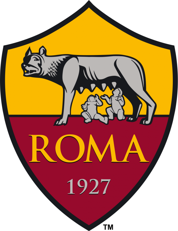
Only minor color changes and more details have been added to Roma’s logo the past two decades. The horrifying thing is that from 1977 to 1997 the Italian club sported this monstrosity.
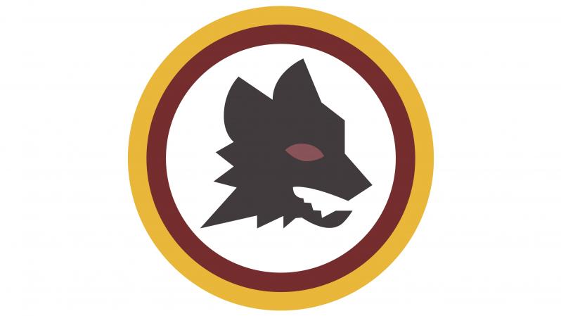
Reverting back to the portrayal of the mythological birth of Rome with the female wolf and the two brothers Romulus and Remus was the right decision.
3. FC Tulsa
In December 2019 Tulsa’s new owners decided it was time for a new identity and changed the club’s name, colors and logo. Previously named the Tulsa Roughnecks, the club made the change to FC Tulsa. The owners put extra effort into designing the logo with the commissioning of Matthew Wolf, who famously designed Nigeria’s 2018 World Cup kits and created the logos for PSG, LAFC and NYCFC. The old logo compared to the new logo is night and day.
Spotted: New Logo for FC Tulsa by Matthew Wolff pic.twitter.com/oWgOpaGeVS
— Pablo (@pablorovalo) January 16, 2020
The bird featured is the scissor-tailed flycatcher, the state bird of Oklahoma.
4. Sporting KC
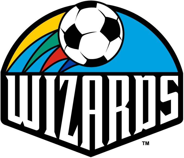
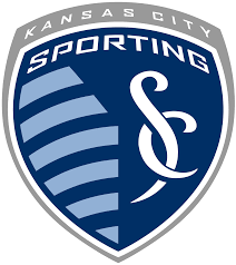
Another American team that made the jump from an ugly 90s-looking logo to a sleeker design is Sporting KC. After a rebrand from the Wizards to Sporting KC in 2011, the logo improved immensely and had more resemblance to a European club. Not that the Kansas City Harry Potters wasn’t cool, but the logo and name change was for the best.
5. USWNT and USMNT
In 2015, U.S. Soccer finally dropped the ridiculous, generic soccer ball from the logo and invested in a new badass crest.
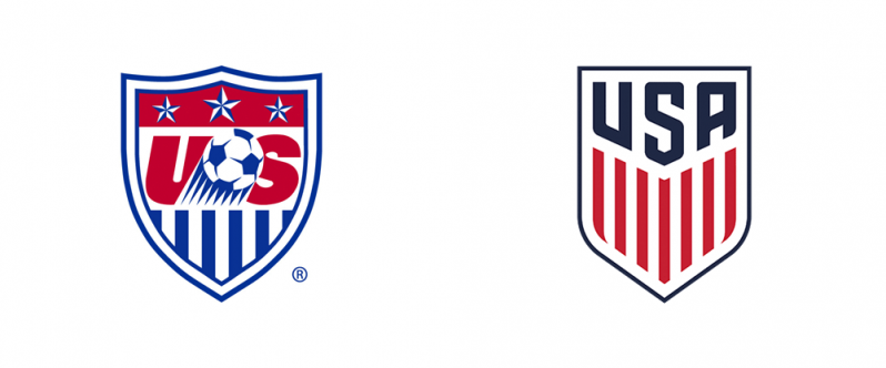
The 13 stripes below the “USA” and the lettering all come together to create a respectable logo for U.S. Soccer. The USWNT crest is extra special because it is forced to rebrand every four years with the addition of another star above the badge because the team can actually compete and win a World Cup.
Just in case anyone wants to know the difference between the USMNT logo and the USWNT logo when purchasing merch, here's a quick side by side. pic.twitter.com/bJ2AWD1L0j
— ck, MS (@CKeithification) July 10, 2019


